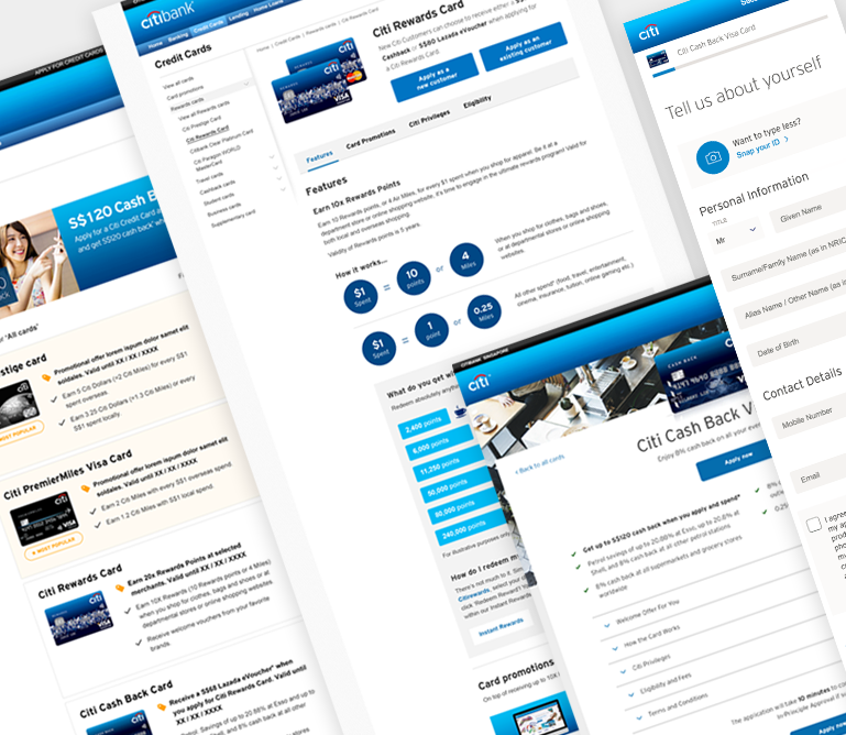
Enter the password

Back
Citibank Singapore
Problem

Credit card onsite optimizations.

Please note: The case study showcases my contributions as a third-party consultant, and Citibank owns full rights to the work.

About

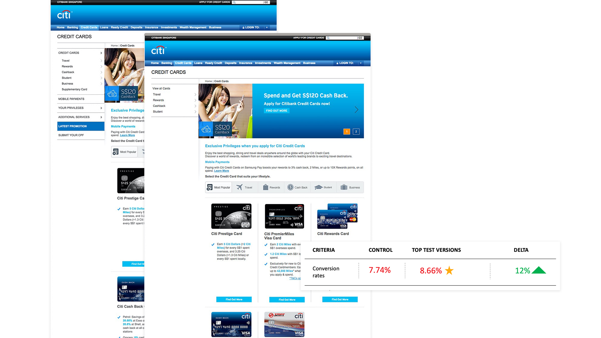
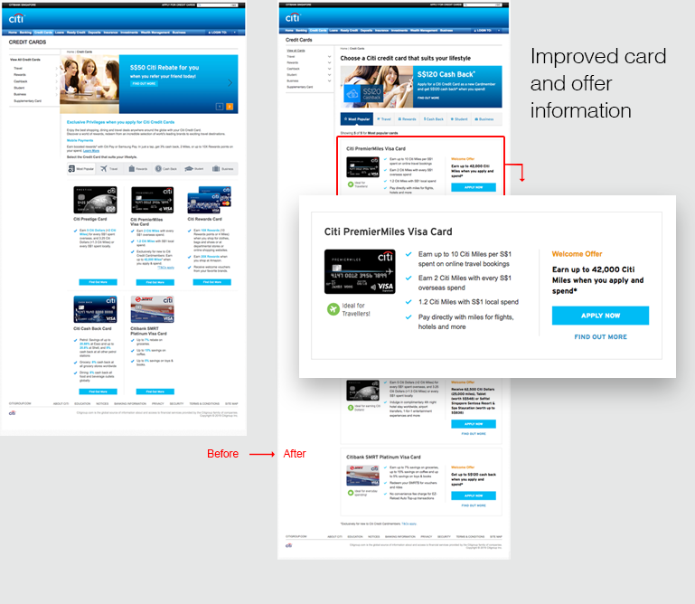
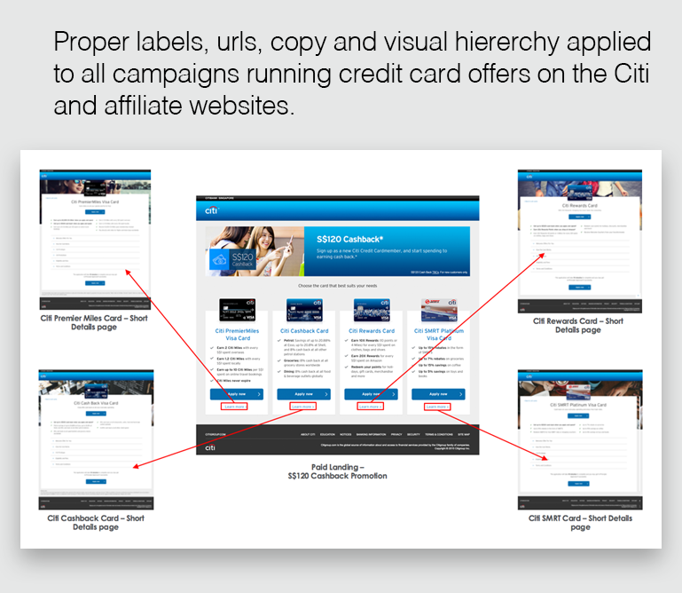
Citibank launched an annual promotion campaign aiming to acquire new customers for popular credit cards. Even with an instant approval offered on successful applications through the website, it wasn't turning out as effective as expected.

Goal

Improve conversions on credit card pages through promotions by lowering the abandonment rates on online applications.

Timeline

March - Nov 2016

Role

UX lead and designer

Team

Visual designer, copywriter, front-end developers, SEO specialists and Data analysts.

Tools

Axure (Wireframes), Photoshop (Visual Design), Google sheets

Research

Start the discovery process

Got an alignment on these activities by conducting stakeholder sessions and our onsite team:

  • The primary goal was to acquire new business
  • Setting up project activities & rituals such as Standup, Reviews, and Sprints
  • Alignment of tools, deliverables, and partners within Citi

Citibank Singapore

Customers journey goals

In order to understand the critical requirements and user needs, we conducted an Empathy map exercise that led us to split our goals onto customers journey of:

  • Learning: Customers are able to see relevant credit card benefits and promotions.
  • Applying: Customers are able to fill the application form without errors and be reminded of the cards benefits with promotion throughout the end journey

login

Upper to lower funnel

Performance across the journey

Learning/acquisition:

  • A low conversion rate of 2.7% on paid traffic: The majority of customers were coming in via affiliate paid websites and media.
  • Only 43% of card category page traffic moved to card pages
  • Only 4% of prospects moved to card pages from the homepage
  • Product pages had high unique visits but low conversion rates

Applying/conversion:

Breakdown of traffic drop-offs from start to finish of the application

login

Drop-offs throughout the application

Design audits and findings

Identified a few areas of usability pain points after the synthesis and built recommendations around the entire journey:

Task: The customer is looking for a card and notices a promotion ad that leads them to product pages to application.

    Findings:

  • Paid media directed the traffic to the homepage than card pages
  • Lack of consistent messaging, visuals, and promotion information from paid media to the card pages, led to customers abandoning the journey.
  • Unnecessary links to other products on card pages
  • No preliminary instructions before starting the application take customers away from finishing the form in mid.
  • Abandonment information on page-level but no visibility on which form fields customers are getting stuck and leaving
  • Need consistency across campaign landings with product pages
Solutions

Recommendations

Proposed recommendations for tests and direct implementation based on the hypothesis.

SN. Tests proposed Track Status
1 Removing extra links from left navigation within credit card pages CTR on all card links on nav Test finished
2 Enhanced card listing design with promotion info CTR on "Apply now" and "View more" links Test finished
3 Enhanced card details page with promotion info CTR on "Apply now" and "View more" links In queue*
4 Credit card application form design and copy enhancements based on field level tracking CTR on each step and final submission In queue*
5 New design enhancements to campaign pages for consistency CTR on "Apply now" and "View more" links Direct change

Delivered UX and design artifacts to support tests and the build

Wireframes: Low fidelity wires were created to showcase screen interactions and type of content changes

Flows: With the existing site structure and wires, user flows were created to understand the interactions.

login

User flows

Visual assets: Detailed transformation of wireframes into visual assets for many flows.

Results

New experiences and designs were launched on the site after the tests.

Left nav

login

Test results: 8.66% uplift on BAU. Design is implemented.

Credit card list

login

Test results: 10% uplift on BAU. Design is implemented.

Credit card online application

login

Results: Design is implemented.

Affiliate and campaign pages enhancements

login

Results: Improved experience at affiliates.

Shared learnings

Learnings from the tests were implemented on the website. These insights were also shared across other Citi teams in the Philippines, Hongkong, and Malaysia.

Digital Playbook

Once the team rolled off, we handed over a playbook that included a library of components, designs, completed test insights, and future tests planned.

...

Thank you for reading. Reach out to chat more or connect on LinkedIn.